Hey everyone! I’m so happy you decided to visit my blog.
Today I want to talk about color. I am not a professional artist – card making is my hobby. So choosing a color palette to use for my designs can sometimes be a little overwhelming. But I have two design secrets that I use to help with this, and I want to share them with you today.
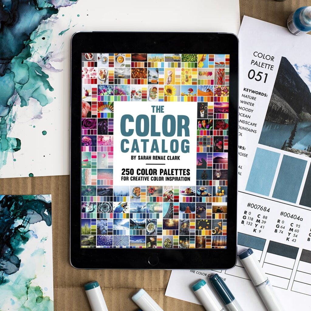
My first design secret is The Color Catalog, by Sarah Renee Clark. Sarah is a wonderful artist and she took her knowledge of and experience with color to create a collection of color palettes that is great for both hobbyists and pros. There are several digital volumes available as well as her new Color Cube that has cards you can use to guide your color choices. I find myself using The Color Catalog over and over to help me with my card designs. I’ve put the link to her website below for your convenience.
Even with a designated color palette, it can be daunting to know how much of a color to use where. And here’s the second secret tool I use that makes choosing color proportions easy! It’s the 60-30-10 Rule. Simply put, the 60-30-10 rule states that 60% of your design should be one color or group, 30% is made up of another color or group, and 10% is for the third color or group – think of it as an accent color.
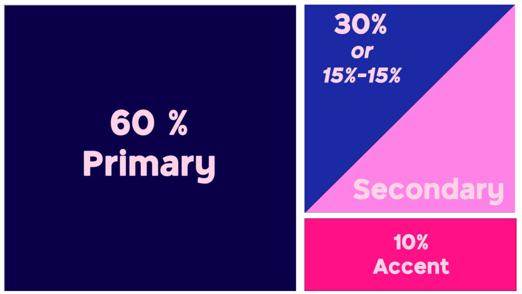
The rule sounds simple, but in use can be a little tricky, so I thought I’d walk you through the process. I created this card based on a color palette from The Color Catalog. I’m going to show you how to use the color palette and the 60-30-10 rule to help guide you to the best color balance for your card or design.
Featured Products
Spellbinders Floral Reflections Bundle
PinkFresh Studio FANCY SCRIPT WORDS Die Set
PinkFresh Studio FANCY SCRIPT WORDS Hot Foil Plate
Embossing Folder Die of the Month Membership – Spellbinders Paper Arts
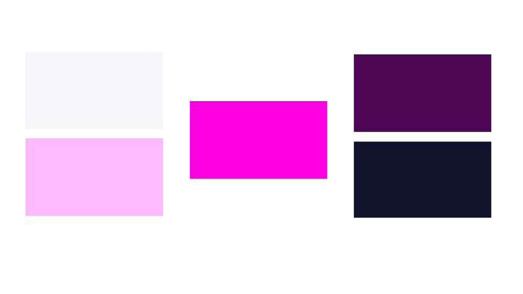
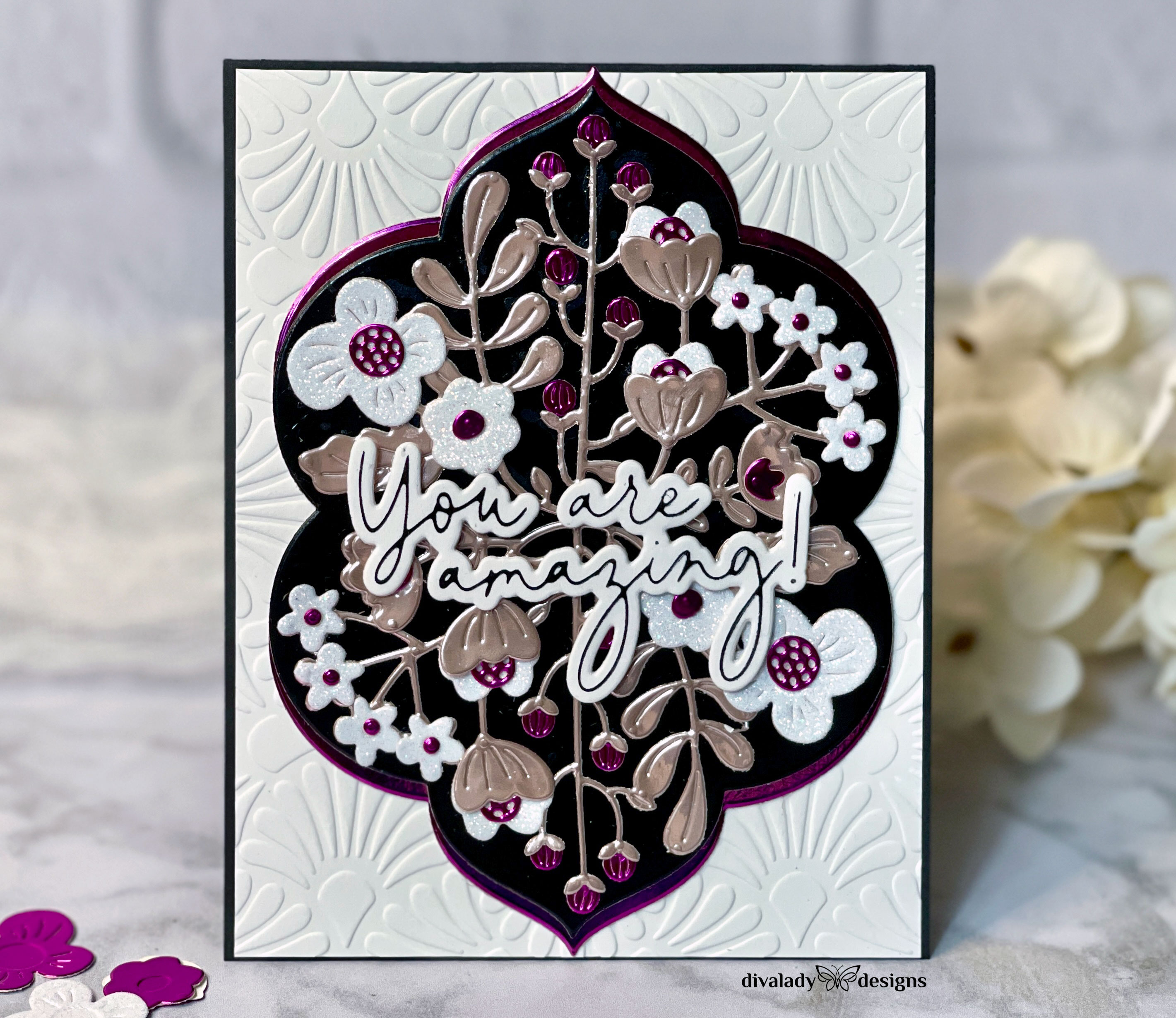
Here is the color palette I chose. It has various pink shades, as well as black and white. I didn’t have any pinks that matched the bright color, so I chose purple/magenta foiled cardstock that was a great combination of the darker pink. For my light pink I chose a blush rose mirror cardstock. Black glossy cardstock worked for the black color, and for my white, I chose the GORGEOUS white glitter cardstock from Hero Arts.
To begin, I laid out all the cardstocks. Then, I die cut some flowers and laid them out on the cardstocks to see what might work. I tried to vary the colors and arrangement. This helped tremendously. I could tell that the darker pink could easily overwhelm the card, so that would end up being an accent color. The lighter pink and black were more neutral, so those would be my middle colors. Looking at how color contrasts or blends can be a great way to decide how much to use for your design.
In the end, I decided that white would be my main color for 60% of the design. Both the black and the rose color would be my next biggest color. I loved the black for the frame, and the rose was perfect for the larger die cut. The darker pink/purple would be my accent. With the color proportions set, I began to put the design together.
One of the beautiful things about this color rule is that it helps you stay on track. You can play around and experiment with different combinations until you get it just right. I recommend laying everything out before you glue it down. I started out thinking that I wanted the flowers to be dark pink. However, when I laid it out, it became apparent that the darker pink took over the design and was much more than the 10% I had allotted to it. When I swapped it out with white, it was much more pleasing to the eye and fell into proportion.
The 60-30-10 rule is not hard and fast – the numbers don’t have to be exact, or you don’t have to use all the colors of the palette. I combined the dark pink and purple into one, for example. The idea is that you plan out the general proportion of color and then work within the decision.
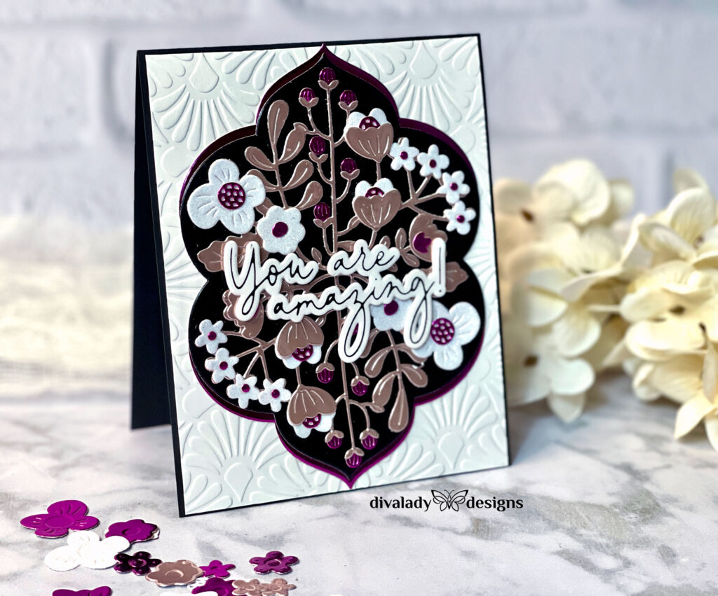
Look at the beautiful floral frame! I love how the white flowers created a flow across the center! But I felt that it needed a little more of the dark pink. So I cut another frame from the magenta mirror cardstock to layer behind the black. I cut it in half and glued half to the back of the black frame. I set it so that the pink color peeked out above and along the sides of the black frame. Perfect! I’ll repeat this with the other side and now I have a beautiful, framed image.
I centered my frame onto a white panel which I had embossed with the Spellbinders Fan Motif Embossing Folder (the Nov. Embossing Folder of the Month). The panel measures 4-1/8 by 5-3/8”. I then adhered it to an A2-sized, top folding black card base.
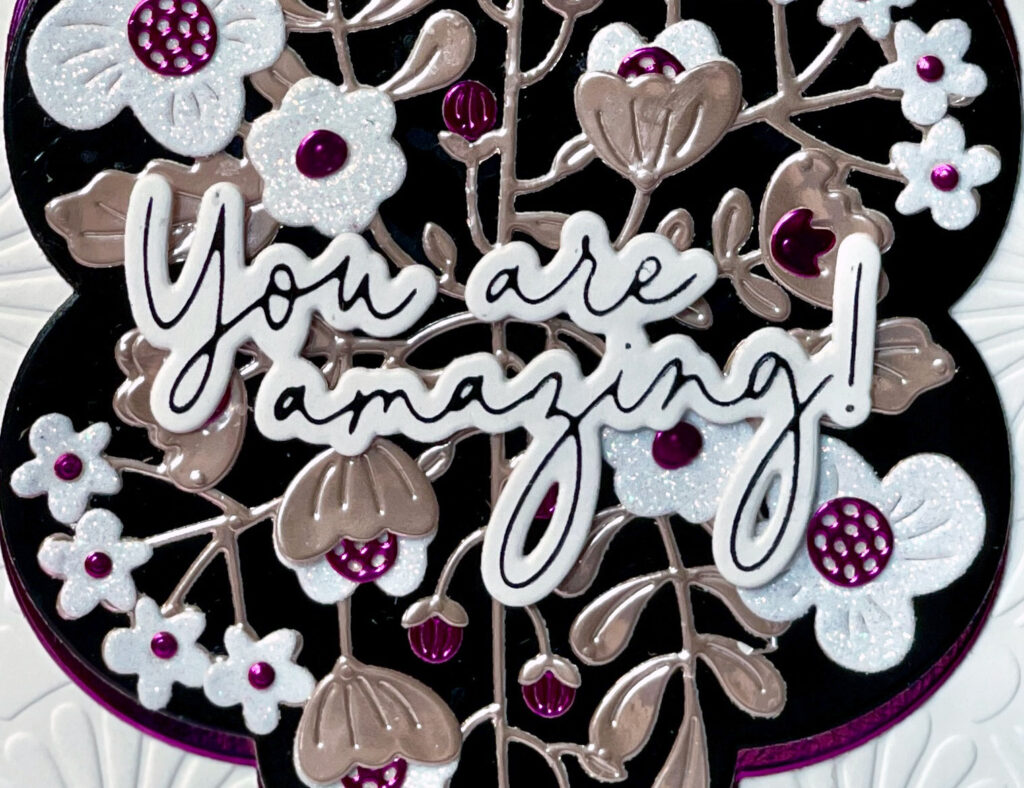
For my sentiment, I used one that I found in my sentiment stash. It’s a foiled sentiment from PinkFresh Studios Fancy Script Words Hot Foil & Die set. I use this a lot in my cardmaking it’s one of my favorite sentiment sets. I love it because of the size and because in addition to “thanks” and “happy birthday” it has such greetings as “You are Amazing” and “You are the best”
I love this card. To use it, I’ll put a smaller white panel on the inside where I can write a personal message.
I hope you’ve enjoyed this post and that you will experiment with color palettes! Check out the Color Catalog – you won’t be sorry you did. I’ve listed all products I used below along with links if you’re interested. Happy Crafting!
 Spring Online Card Camp 2022
 My Altenew Educator Adventure
 Creating Mood with Color
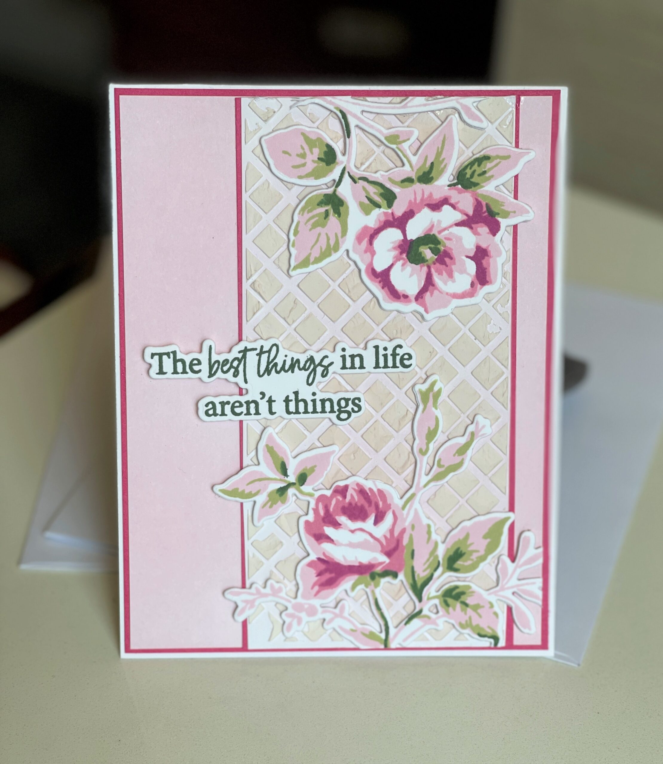 All About Layering 4: The Best Things In Life Aren’t Things
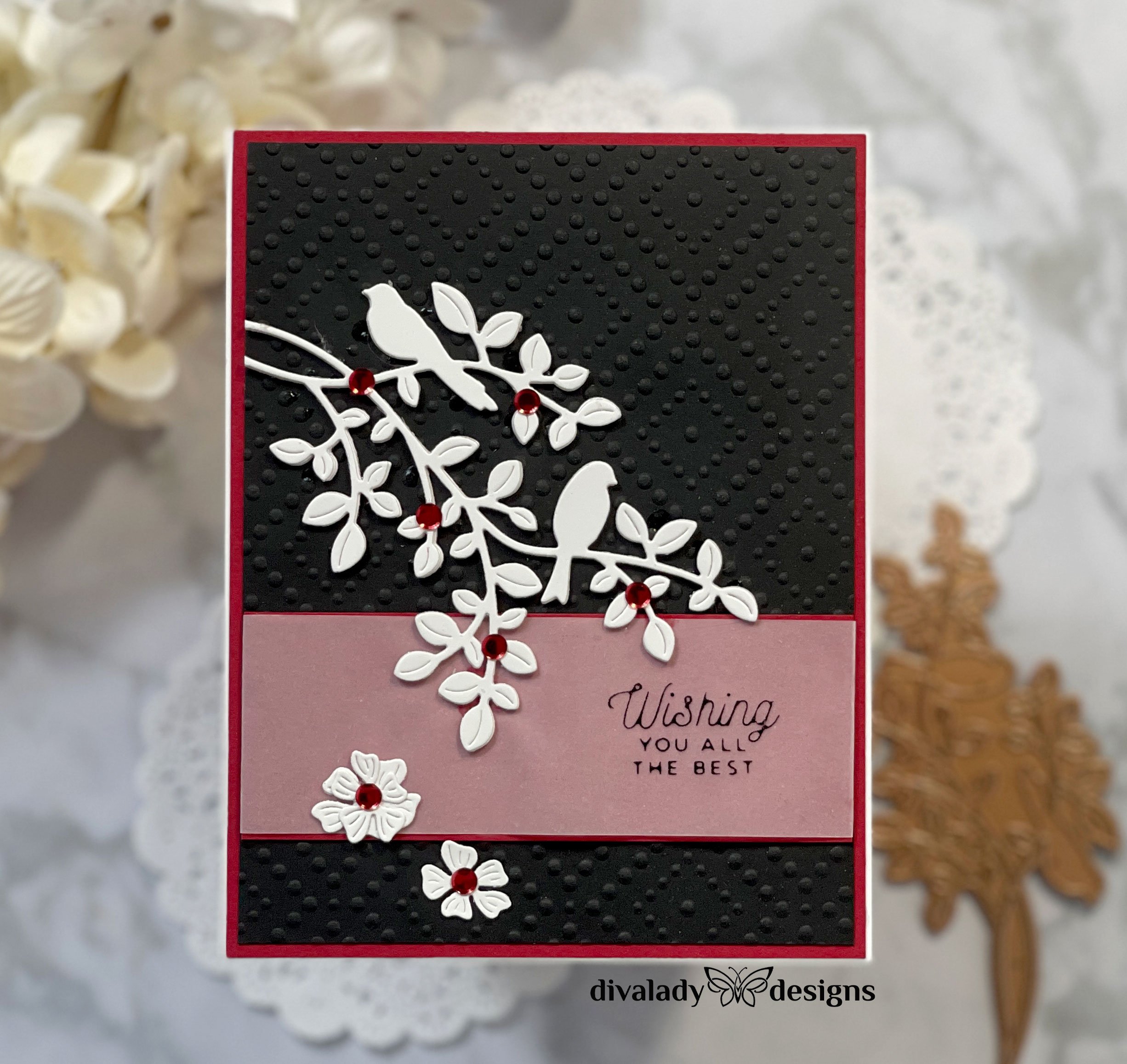
